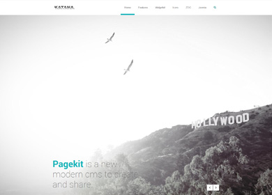
Features
This theme is built on the Warp framework, a well-engineered theme framework for WordPress and Joomla, and utilizes all of its latest features. The user interface is powered by UIkit, a lightweight and modular front-end framework, which provides the theme's styling. The theme also comes with a wide range of different layouts and widget variations.
Warp Framework
A fast and slick theme framework which is built on the latest web techniques like HTML5, CSS3 and PHP 5.3+
UIkit
A lightweight and modular front-end framework for developing fast and powerful web interfaces.
Styles
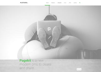
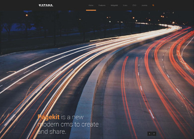
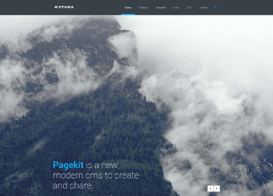
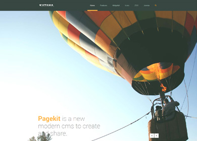
We provide lovingly crafted style variations to give you a glimpse of what is possible with this theme. The built-in theme customizer allows you to modify colors, fonts, sizes and much more without any CSS knowledge. Just choose your colors with the color picker and adjust the theme with only a few clicks. Click on one of the images to see the style.
Layout
We've added the option to choose between a classic wrapped and a modern wide screen layout.
Wrapper
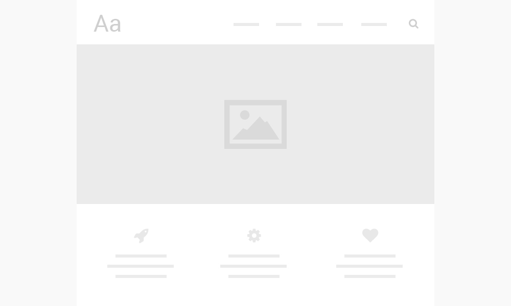
Fullscreen
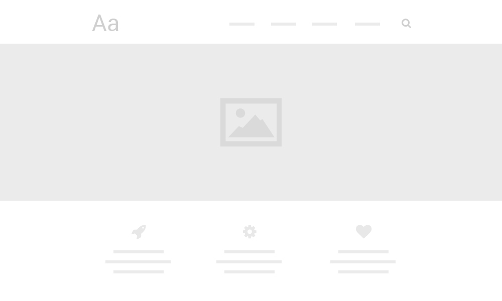
Full height slideshow
We created a custom style for our Widgetkit Slideshow perfectly fitting the theme. Plus you can set the height to fit the viewport.
Wrapper
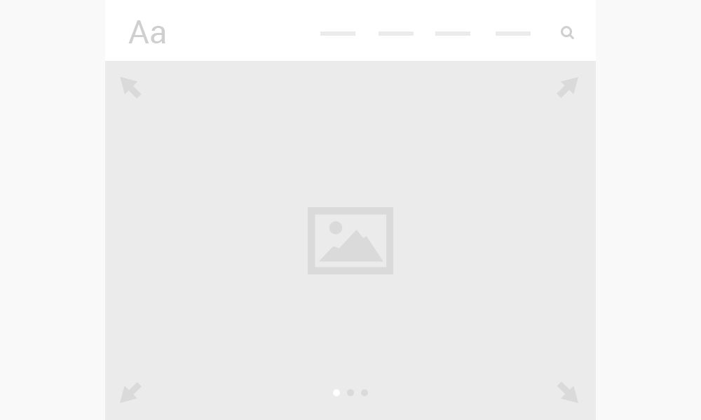
Fullscreen

Charts
Katana comes with some cool charts you can easily customize. Just use the markup below. You can choose between 3 types by adding one of the following type attributes into the chart element, Pie, Doughnut, PolarArea. In addition you can add a width and height.
For each item you can define specific options. Just add data-tm-chart to the item element. You can add as many as items as you want.
| Option | Description |
| label | Defines a label on item hover. |
| value | Defines the value of each item. |
| color | The first elements are defined with the default theme colors by default. You can override them for each item. |
| highlight | Defines the hover background color for each item. |
Pie Chart
Doughnut Chart
Polar Area Chart
Markup
<chart type="Doughnut" width="500" height="500">
    <item data-tm-chart="{label: 'Primary', value: 200, color: '#f00'}"></item>
    <item data-tm-chart="{label: 'Secondary', value: 200, color: 'rgb(255,0,0)'}"></item>
    <item data-tm-chart="{label: 'Tertiary', value: 100, color: 'red'}"></item>
</chart>
Custom Overlay
You can add a cool hover effect to images by using the code example below.
Markup
<div class="uk-overlay tm-overlay">
    <img src="/" alt="">
        <a href="/"></a>
        <div class="uk-overlay-area">
            <div class="uk-overlay-area-content">
                <h1 class="uk-h3 tm-overlay-headline">...</h1>
                <p class="tm-overlay-content">...</p>
            </div>
        </div>
    </a>
</div>
Tile Grid
Katana comes with a fully customizable grid like you can see on the frontpage. You can build any kind of grid you want by using the Grid Component UIkit provides including the default UIkit responsive behavior.
Lorem Ipsum
Lorem Ipsum
Lorem Ipsum

Markup
To remove the grid gutter, add the .tm-grid-gutter-remove to the parent .uk-grid element. You can choose between 3 types of content within your tiles:
- Content
You can insert any kind of content here starting with a
divusing the class.uk-position-cover. To get a colored tile you can add any kind of panel you want like in the example below. - Image
The image you put into your tile will automatically cover the area.
- Image with overlay
The image with the overlay effect has the same behavior as the regular image. You can use the default UIkit overlay or add the class
.tm-overlaylike in the example below to get the Katana overlay.
NOTE To set the width and height of your tiles use data-tm-grid-tile="..." on the div containing the .uk-width-* classes directly before the content. The single tile size depends on the number of columns you create with the grid.
<div class="uk-grid tm-grid-gutter-remove">

    // 1. You can use every kind of panel here
    <div class="uk-width-1-2" data-tm-grid-tile="2x1">
        <div class="uk-position-cover uk-panel uk-panel-box">
          ...
        </div>
    </div>

    // 2. Just an image without hover effect
    <div class="uk-width-1-3" data-tm-grid-tile="1x1">
        <img src="/" alt="">
    </div>

    // 3. Image with an overlay effect
    <div class="uk-width-1-3" data-tm-grid-tile="1x1">
        <div class="uk-overlay tm-overlay">
            <img src="/" alt="">
            <a href="/">
                <div class="uk-overlay-area">
                    <div class="uk-overlay-area-content">
                        <h1 class="tm-overlay-headline">...</h1>
                        <p class="tm-overlay-content">...</p>
                    </div>
                </div>
            </a>
        </div>
    </div>

</div>
Social Icons
Use the modifier .uk-icon-button class to create an icon button.
Here is a little code example how to add them:
<a href="#" class="uk-icon-button uk-icon-twitter"></a>
<a href="#" class="uk-icon-button uk-icon-facebook"></a>
<a href="#" class="uk-icon-button uk-icon-google-plus"></a>
Here is an overview of all icons provided by Font Awesome.
This theme is available for Joomla and
WordPress including the same features on each system.
